A Fresh Look for Impressed
packaging refresh for IMPRESSED
SERVICES
Campaign Design
Art Direction
Final Artwork
THE BRIEF
Impressed sought a brand refresh to strengthen its appeal to a younger, Gen Z audience. The goal was to evolve the existing identity while retaining recognisable elements that held brand equity.
RESEARCH + CONCEPT DEVELOPMENT
The refresh began with a thorough audit of the current brand. I evaluated which assets were performing well, identifying the block colour coding on pack tops as an effective and recognisable feature. I then explored areas needing improvement, focusing on strengthening brand personality and modernising the visual language. This led to concept development for a revised logo, brand mark, and a refreshed illustration style to better resonate with the target audience.
the result
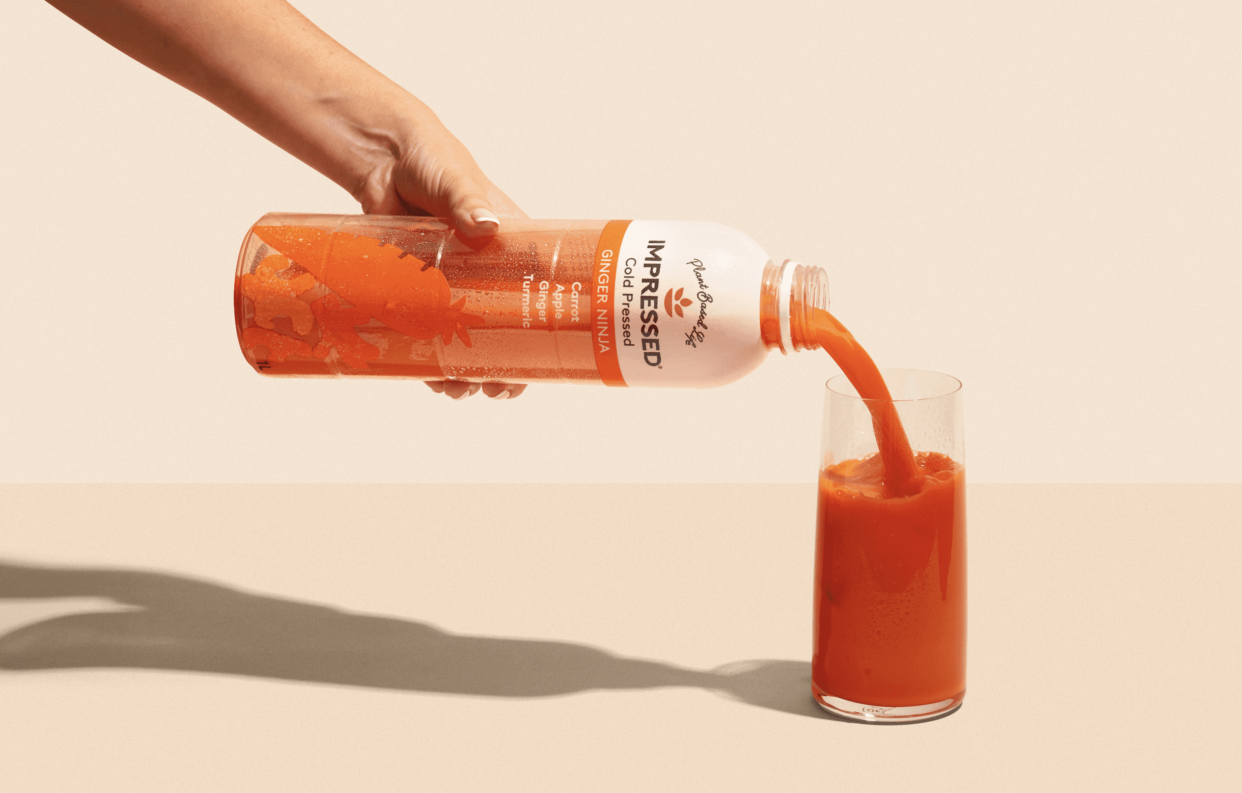
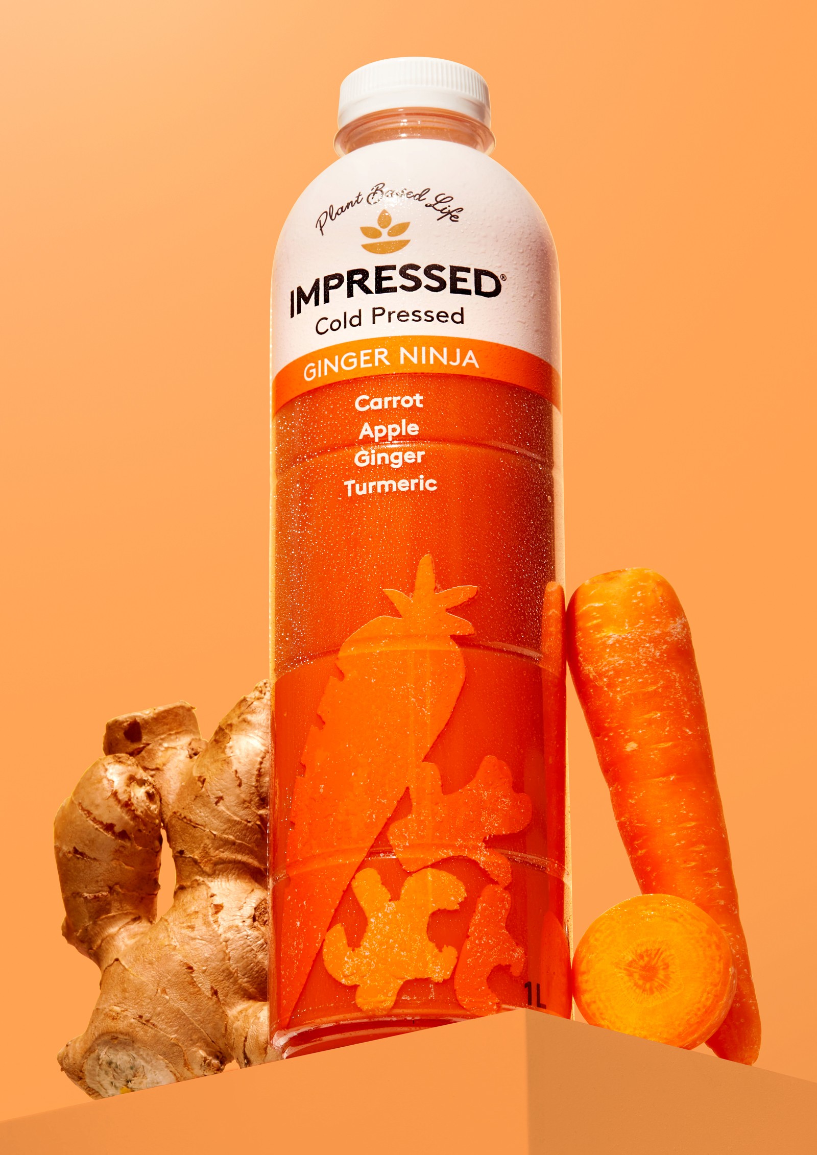
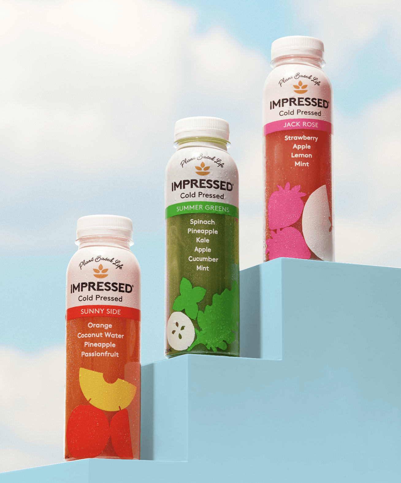
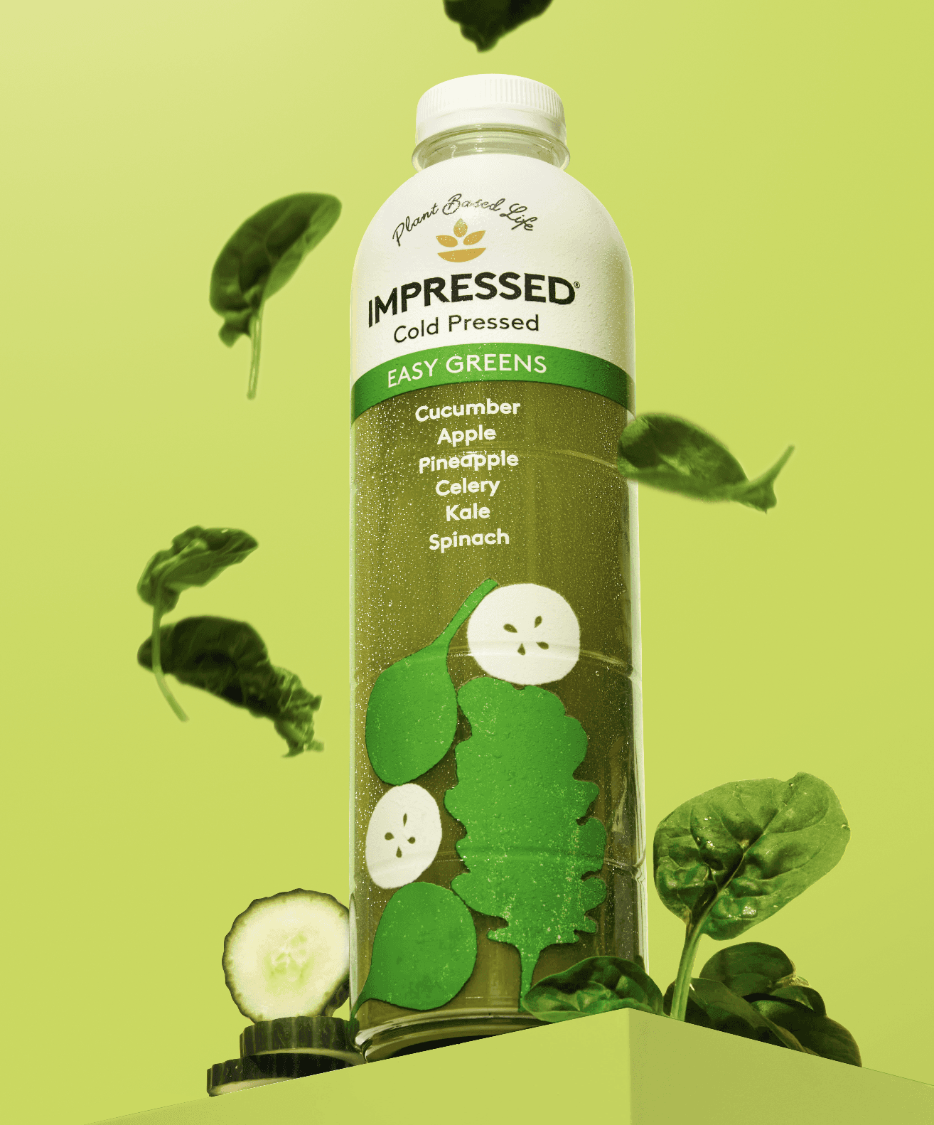
The outcome was a refined brand identity that felt fresher, bolder, and more aligned with Gen Z preferences. The updated pack illustrations brought energy and clarity to the packs while retaining key brand elements for consistency and recognition.